
Introducing Creativity Under Capitalism's visual refresh
Because the word "branding" still makes me throw up in my mouth a little.

If you’ve clicked on the Creativity Under Capitalism homepage or on my Substack profile within the past few days, you might have noticed a bit of a change.
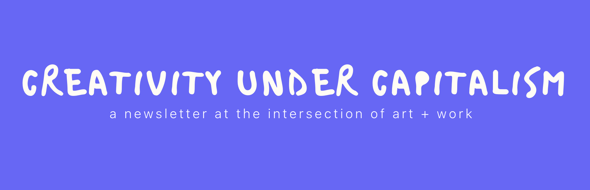
Creativity Under Capitalism is coming up on three years of existence (!!!) as well as a major subscriber milestone (for me, anyway). To celebrate, I’ve given it a facelift. Don’t worry: the newsletter itself hasn’t changed. The warmth, curiosity, and thoughtfulness you’ve come to know are still here, but they’re wearing nicer clothes.
Wanna see?
THE NEW VIBE vs. THE OLD
If you’ve been with Creativity Under Capitalism for a while now (thank you!), you’ve probably seen me test a few different variations of the same general aesthetic. For almost two years, every post got an incredibly simple header image with a periwinkle background and a light green, two-dimensional doodle. This was easy to do, but every post started to look the same at a glance, so I shook things up by introducing gradient backgrounds with a bit of texture, then black-and-white elements with a “screen” overlay.


While I do think this was an improvement, it was tricky to keep these new headers consistent enough to establish a reliable “brand identity1.” The extra dimension also clashed with Creativity Under Capitalism’s wordmark and logo, which each consisted of only two shades and had the appearance of being hand-drawn.
This awkward mashup quickly became stale, to put it nicely. I was fully committed to the newsletter’s trademark colors and playful vibe, but wasn’t sure about how flat everything felt. I also wasn’t sure whether it felt like “me.”
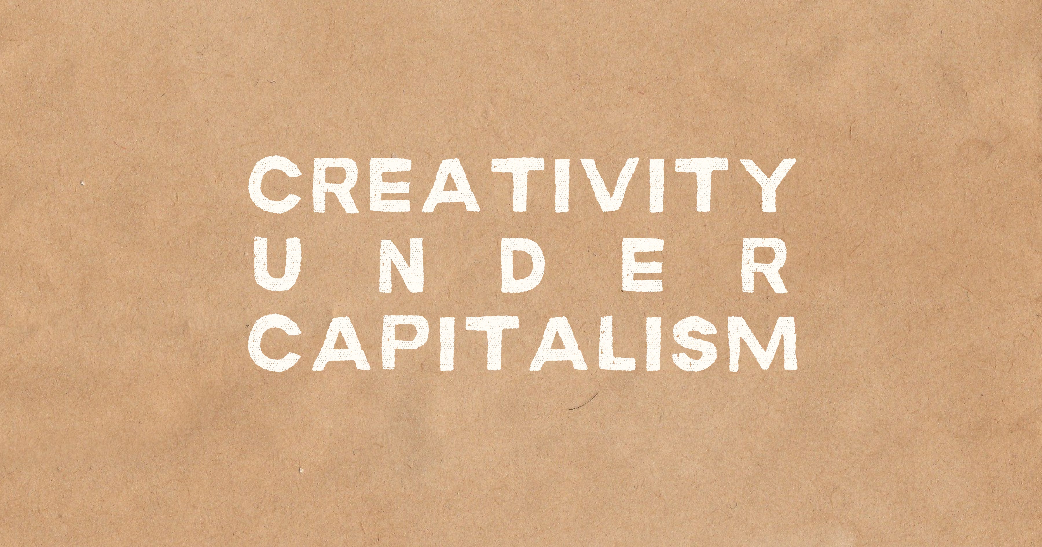
As I began to explore a “brand refresh” a couple of weeks ago, a new idea came to mind. I’ve always loved paper: feeling its fine details with my fingertips, smelling the fanned pages of a new book, selecting prints in various textures to hang on the walls in my home. Paper can be serious, but it can also be playful. It also isn’t limited to one particular art form.
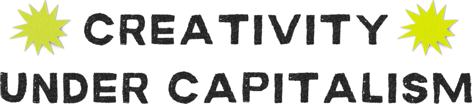
In exploring this particular thread, I found assets that spoke to me: namely, a font that gives the appearance of freshly-stamped ink (Macabro Danger) and shapes that looked like they had been cut from colorful paper (created by SparkleStroke on Canva). I loved the texture these lended, but the periwinkle and green of yore looked washed out when rendered in cardboard, hence the slightly bolder shades you see on the homepage today.


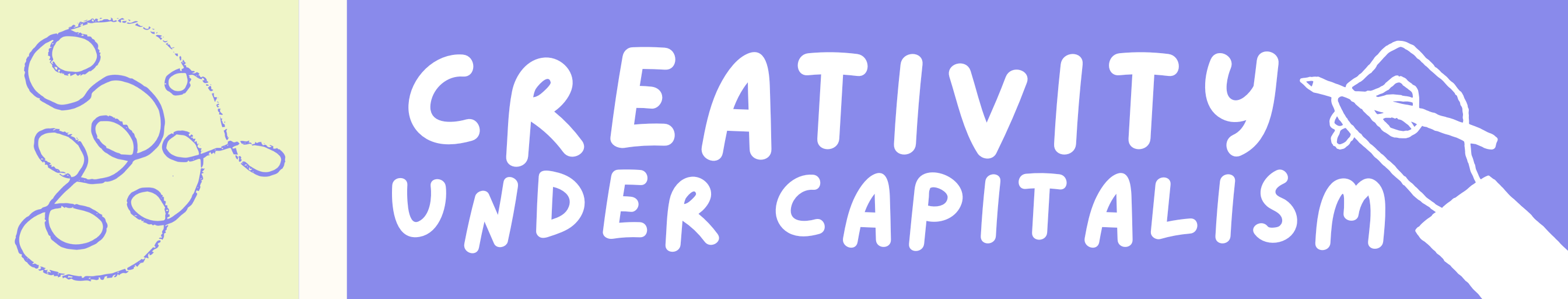
To me, the combinations pictured above—as well as the logo you should see in the header of this email—created much more visual interest than the previous stuff but didn’t sacrifice what originally set this newsletter apart. Still, I worried that changing the newsletter’s styling so dramatically would somehow turn off the readers who have been here from the beginning. I decided to take a stab at more faithfully refreshing the original style with another “hand-drawn” logo font (Bristol), 2D blob assets, and the same bold colors you see above, minus the cardboard brown. Then I asked my trusty advisors (AKA my partner and a few friends) which style appealed to them. Though they liked the updated-old-school look, they unanimously signaled what I’d feared they would: that the papery aesthetic was far more interesting and would thus be worth the exhausting effort of revamping pretty much everything.
I’ve slowly started to redesign the header images on many of the newsletter’s most popular posts, but you’ll still see the old vibe if you dig through the archive (which of course I implore you to do, especially if you’re new here). And while most of what I’ve used so far are Canva assets, I’m excited to try my hand at creating simple collages IRL to use as headers on future posts.
Whether you’ve been with Creativity Under Capitalism since the doodle days or you’ve just recently subscribed, thank you—the time you spend reading this newsletter means more to me than you’ll ever know. I hope you enjoy the new vibe. Making it was one of the most addicting creative projects I’ve worked on this year.

I know there is real value in a brand identity, but I don’t love the corporate connotation. Happily accepting alternatives, if anyone knows any!
Love love love the new vibe!
I love it!!! Great job :')